

why I built the first map of America's defining problems
they say build the things you wish existed

how it all started
Six years ago I left a cushy corporate job to learn everything I could about climate tech — what was, at the time, a sprawling universe of companies building around clean energy, emissions reduction, food systems, and every other slice of the environmental landscape. I was betting the energy transition was the defining challenge of our time, and I wanted to understand it from the inside.
My starting point looked a lot like most people’s. Shaped by apocalyptic headlines, low-key dread, and the persistent sense that we were losing ground fast. That was my mental model walking in.
It didn’t last long, though.
I remember a week-long stretch spent in full discovery mode — finding organization after organization doing serious, exciting work on the climate problem. Nonprofits, nuclear startups, supply chain overhauls. The deeper I went, the better I felt. I came into that week as a concerned, borderline exasperated citizen looking for somewhere useful to put my energy. I left completely obsessed. Anxiety turned into legitimate optimism. I went from outsider to someone who felt capable of actually engaging with the problem.
But as I started mapping what I was finding, trying to understand how all these initiatives related to each other, who was working on what, where the leverage was, a different problem emerged.
The space was fragmented. Despite persistent calls for coordination, there wasn’t much of it in practice. There were hundreds of organizations doing excellent work in relative isolation from each other. No shared map, no coherent picture of the field.
Then I found Speed & Scale.
John Doerr (veteran venture capitalist, climate advocate) wrote a book that did something I hadn’t seen done before: took a framework used to run companies and applied it to the entire climate problem.
He broke the space into six categories with specific, measurable targets nested inside each one. It was a way to look at the whole field at once and understand what was moving and what was stalling. I didn’t realize how much I’d been craving exactly that until I was reading it. Something in me shifted again, as that newfound optimism turned into real agency. I no longer felt disoriented by the sheer complexity of the problem.
And that, it turns out, is the whole game. Orientation is what transforms a concerned person into an engaged one.
the design problem
That realization has had its teeth in me ever since, because the gap I felt in climate wasn’t exclusive to climate. It’s infused in every problem. The people who care most about this country’s hardest challenges are often the most disoriented by them, mainly because our information environment isn’t built for real clarity. It’s built for engagement.
So they read. They stay current. They pay for the good journalism. And most still walk away without a clear picture of where things actually stand.
That’s a design problem.
Media is built for recency, not real understanding. Academia moves at the pace of publishing cycles. Think tanks go deep on single issues, but the work rarely leaves expert circles.
Nobody is doing the job of stitching it into a picture someone can actually use. We experience the world through individual news stories. Our perspective shifts with whatever story is loudest that week, when I’d argue that what we actually need is a more disciplined, actionable picture of the world around us.
So we all end up with a different version of the same reality. And a country can’t solve problems it can’t see together.
That’s the thing row is built to fix.
the platform
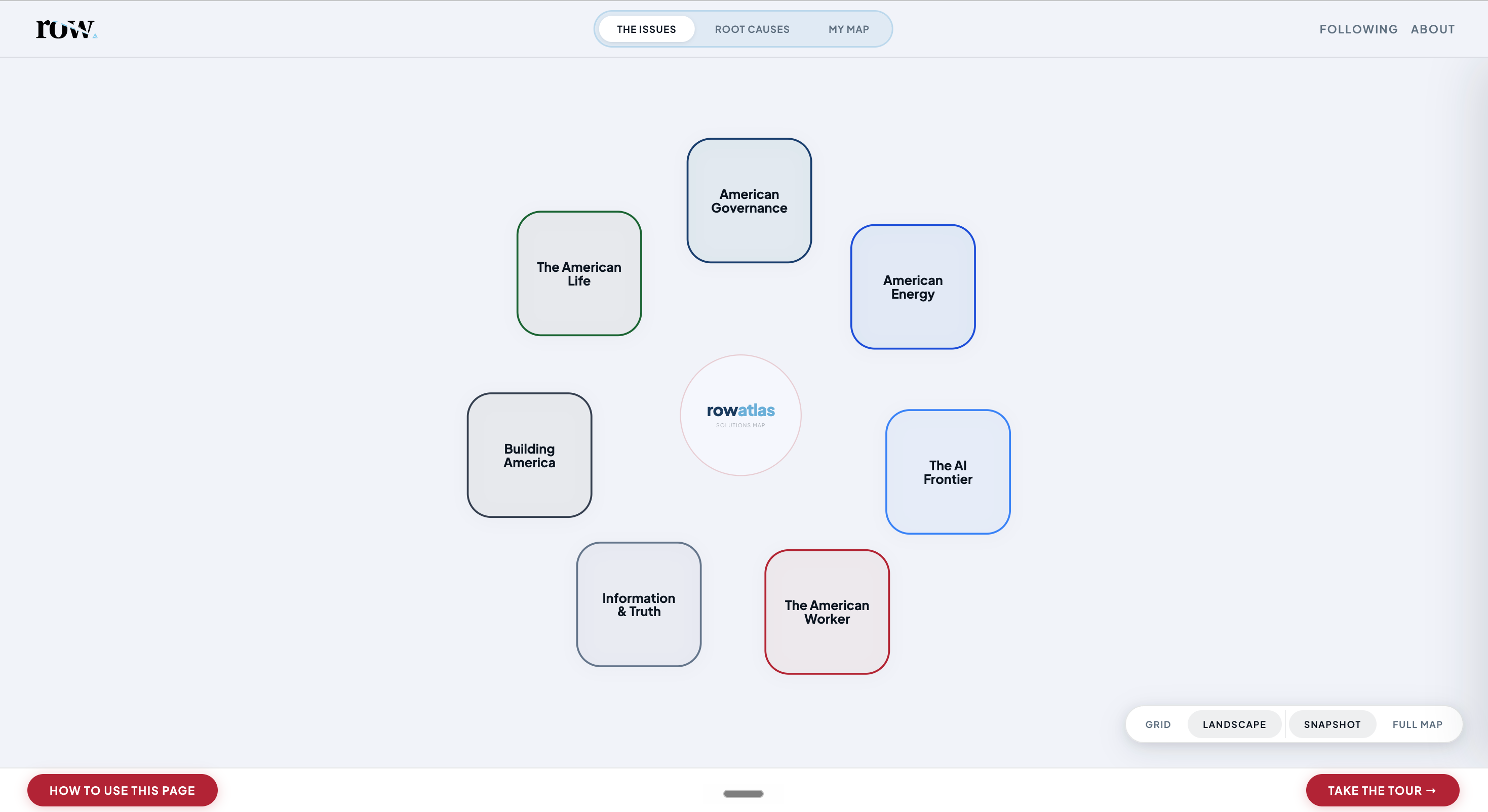
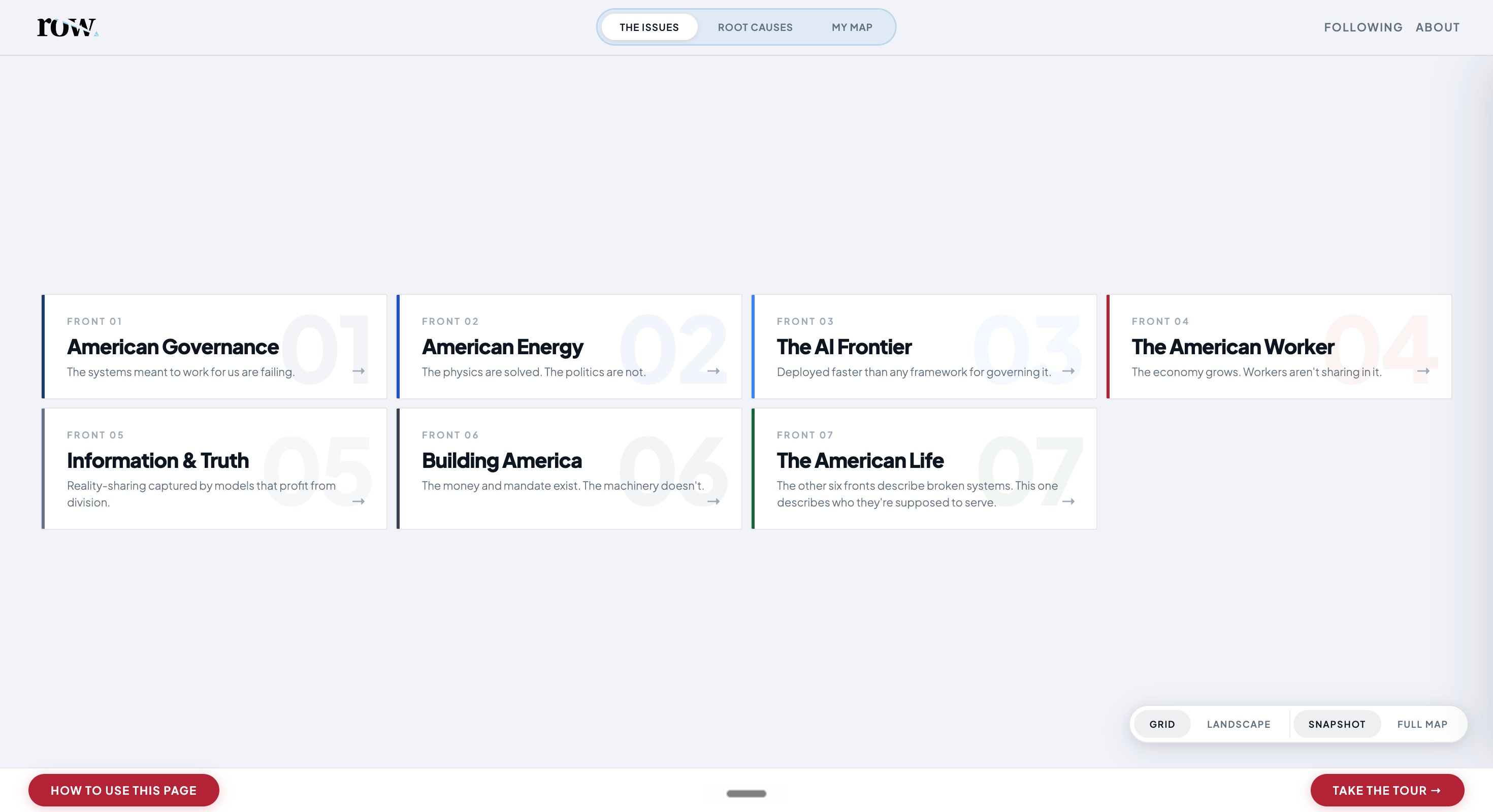
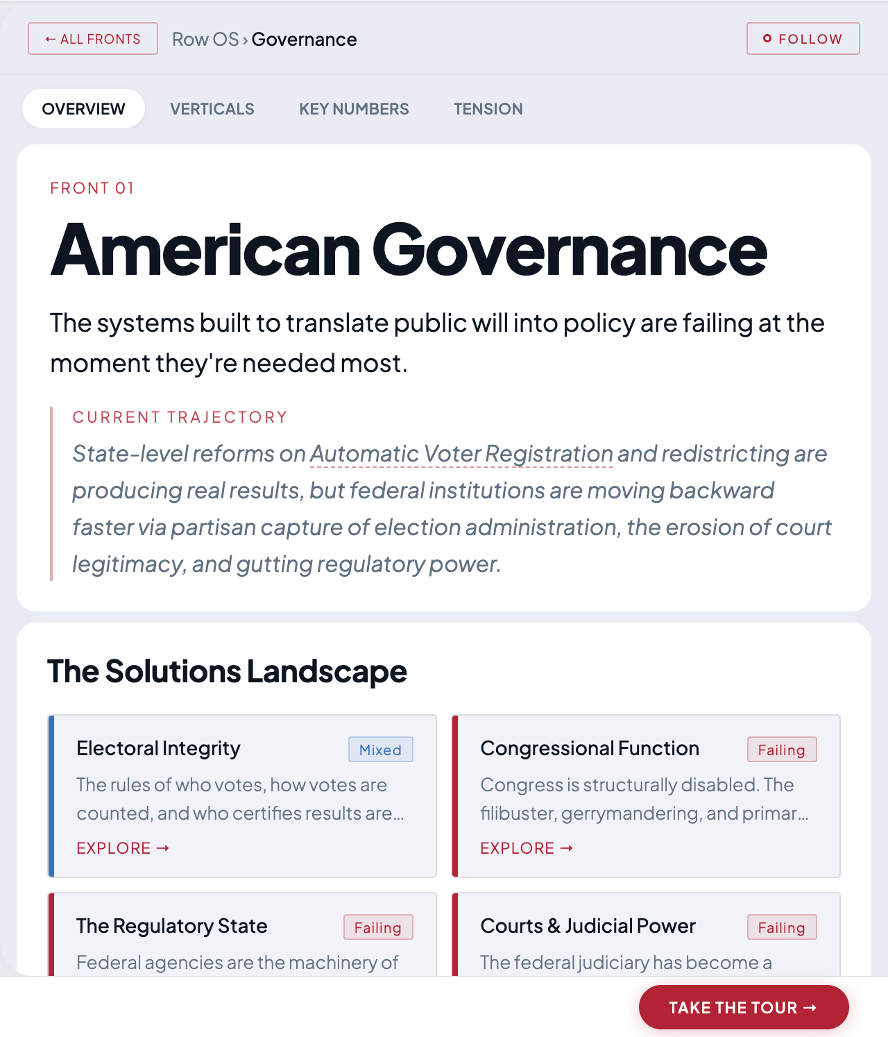
Last week, I launched the row Atlas — the first interactive map of America’s defining problems.
Seven domains broken into twenty-eight problem areas. Each complete with the root causes that many of them share, as well as the most promising solutions, and a live read on where things stand today. All in one place for the first time.
how it works
The seven domains cover the landscape: American Governance, American Energy, The AI Frontier, The American Worker, Information & Truth, Building America, and The American Citizen.
Each has a thesis, a plain-language statement of what’s true right now and what progress might looks like. Click into any domain, and you can drill down to four problem areas underneath it.
Each one carries a status (Accelerating, Mixed, Stalled, or Failing), a trajectory, and a plain rationale for why. Beneath it all sits the root causes: the structural forces that show up across domains and explain why problems that look unrelated are actually stuck for the same reasons.
What I’m trying to build is the thing I was looking for six years ago. A living, breathing map that holds its shape across news cycles. Something you can use to orient in minutes instead of spending months stitching together a picture from a hundred different sources.
The content in there right now is a first pass – directionally right, but not finished. It’ll sharpen over time, and I’m counting on the people using it to help make it better.
introducing row weekly
row weekly (this newsletter, formerly the nuance.) is a space for me to do this work in public. Whether that’s going deep on one of America’s hardest challenges (the format you’re used to) or simply reflecting along the way.
Whether it's a deep dive or a window into the process of building this out, the north star stays the same: you leave feeling America's problems are solvable.
one ask
If you spend time on the platform and have a reaction (a page that felt incomplete, a missing problem area, a trajectory you disagree with), I want to hear it.
I believe this is going to be a long road, and honest feedback from people who care is the only way it gets better.
Stay up.
j